Brand Identity and Design System for Grafana Labs
Roles
Design Research
Website Design
Branding
Promotion and Marketing
Print Deliverables
Event & Environmental Design
Team
Creative Direction: Erik Hageman
Web Development: Robby Milo, Nate Walters, Nick Auger
Video Production: Collins Pace
Grafana Labs is the company behind the leading open-source softwares for visualizing and monitoring operational data.
Throughout my journey of over three years with Grafana, this B2B, SaaS, fast-growing tech company has experienced exponential growth in its product scope, teams, and revenue. I consider myself fortunate to have witnessed and contributed to the early development process of the company's marketing team and branding identity.
Pre-branding Stage
As a young startup, Grafana Labs initially lacked a defined branding identity and demonstrated inconsistent use of design motifs. Both public and internal branding were inconsistent and irrelevant. The website was dull, dark, and lacked personality.

New Brand Identity and Design System
Grafana needed a systematic and cohesive brand identity and design system that could integrate across all touchpoints. The creative Design team and I kicked off the brand development process by redesigning Grafana.com's homepage and other pages with high user traffic.
We immediately wanted to transition from a dark, dull background to a light background to enhance a delightful user experience and to reflect our open-source friendly culture. We also introduced hints of orange shades and signature gradients to establish a visual connection with Grafana's logo and core identity.

The team and I have built a comprehensive library of brand colors, font styles, and web components. By incorporating components from our brand library, we achieved a consistent structure throughout pages and a delightful user experience. Since the redesign, key high-traffic elements of Grafana.com have noticeably improved in terms of UX, SEO, and overall performance.

As we incrementally updated Grafana.com, the Creative Design team and I have also designed logos for our core products, additional products, and internal teams, which together constitute a cohesive set of brand identity.

I have also collaborated with UX and Product designers to create a set of icons integrated into our visualization product. These icons needed to be versatile, adaptable to various scales and sizes, ensure color accessibility compliance for the web, and work on both light and dark backgrounds, as our product offers both light and dark interfaces for our users.

Brand Executions
In line with the website redesign, the team and I have also strived to improve the overall look and feel of key brand executions – social media contents, promotional materials, video contents, and swag items so they are more fun, unique, and more 'Grafana'. We ensured that essential contents (copies, logos, and our product images) were on top of the visual hierarchy; other supporting motifs should not get in the way of the contents.
As shown below, each social media content I have created places a strong emphasis on the clarity and impact of the copy and contents while bold and delightful motifs and colors align with the core Grafana identity.


I was also responsible for creating social media images celebrating national and international holidays to engage with our users and prospects. Check out my illustration works here.
Templates for Internal Teams
The team and I have also helped provide more and better tools that empower Grafana teams and partners to communicate effectively and make a bigger impact in sales. As a lead designer, I have created a master deck templates and document templates. These templates are created using our shared platform (Google slides and docs) and are made of editable, live components so they are user-friendly and hassle-free for anyone in the team to implement and put into use.
These templates not only streamlined the process of creating presentations, documents, and tools for teams but have also helped strengthen brand awareness among the users and partners and helped build a brand identity and morale among internal teams.
The below shows a few of the slides from the master template deck:

I have also supported various teams in creating presentations and communication tools. Here are just a few types of presentation work I have collaborated on with teams:
Company Culture deck (for People team)
Leadership Principle deck (for Leadership)
Customer reference deck (for Customer & Community Marketing team)
Sales Repository deck (for Product Marketing team)
Company Kick-Off All Hands (for Leadership)
Events and Environmental Design
Community Events and Conferences
Once we successfully established our core brand identity and brand direction, the Creative Design team and I began extending and implementing our brand direction to events and conferences. GrafanaCONline (focuses on Grafana tools, features, and new releases) and ObservabilityCON (hosts sessions about open source observability technologies, practices, and tips) are the two major, largest annual conferences and community events hosted by Grafana Labs.
Our process leading up to the events was typically loose and fast-paced. Given the rough guidelines and strategies and the constraints of a tight timeframe, the Creative Design team and I diligently worked through the entire process, from brainstorming and sketching visual concepts for the conference branding to the production of various deliverables.


These two major conferences are typically very successful in terms of registration, have a high impact on our Sales, and are an opportunity to experiment with new visual motifs and expand our core brand identity.
GrafanaCONline 2021 resulted in over 700,000 active installations of Grafana, and with a 90% increase in guest speaker applications compared to last year’s event.
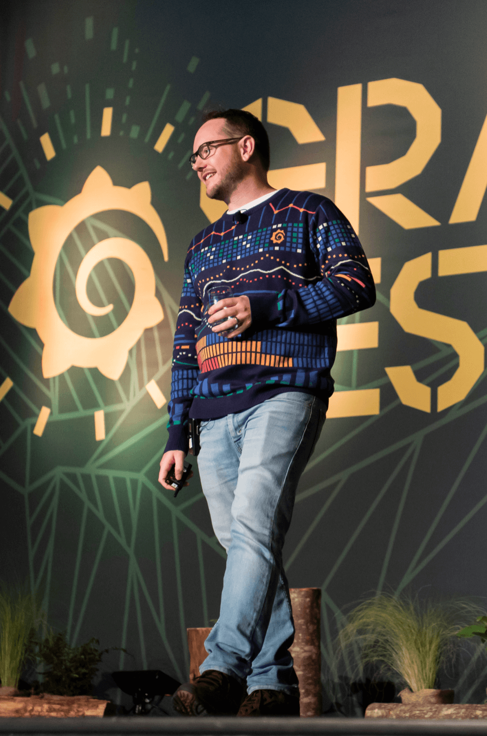
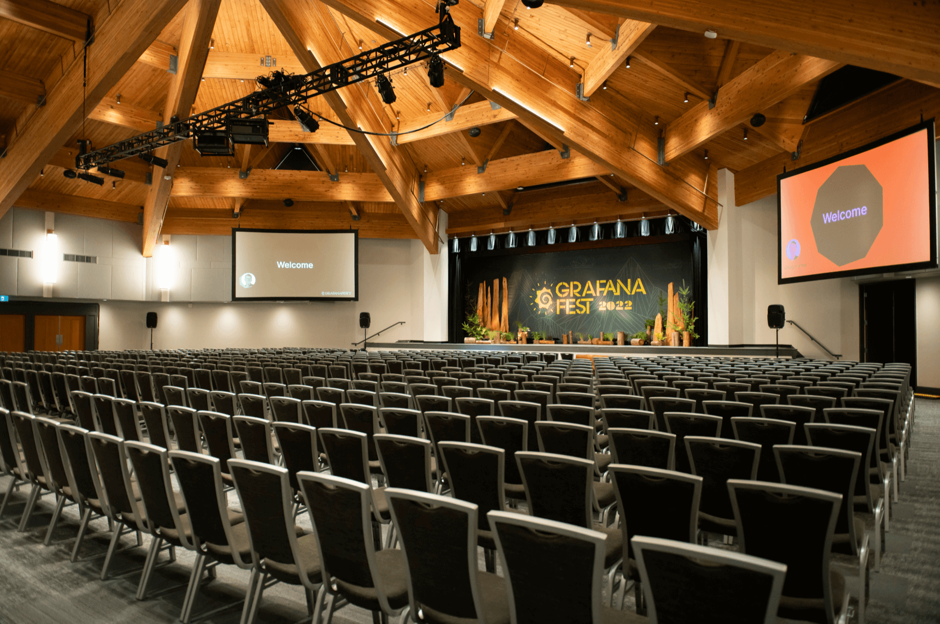
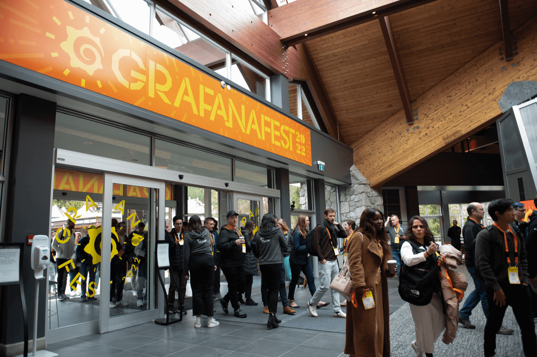
GrafanaFest
In addition to the community conferences, Grafana Labs also hosted a company kick-off event. GrafanaFest, held in Whistler, Canada was the largest and first in-person company social event launched since the hit of the Covid-19 pandemic. The Creative Team and I were responsible for the overall direction, installation, and execution of the conference branding and site design.
We established branding that remained closely tied to the company's core identity while giving a festive, delightful, and playful essence. The event logo and branding drew inspiration from the aesthetics of the conference site and the villages of Whistler. The Creative Design team and I produced all the assets for the huge general sessions and activities along with other atmospheric elements, signages, and onsite materials for the event.
Video Production: Collins Pace