Firepan Logo Design Case Study & Brand Development
Roles
Design Research
Art Direction
Branding
Logo Design
Print Deliverables
Client
Firepan Korean BBQ & Bar
Firepan, the Korean BBQ and Bar restaurant franchise, reached out to me with the hope of updating their outdated dining and bar menu designs. Upon examining their current designs and overall brand standing, I identified issues with their ineffective brand identity and inconsistent use of their logo. Although Firepan had the means and the desire to improve their marketing and brand direction, they were uncertain about their current situation and where to begin.
My goal was to offer brand solutions by analyzing their existing challenges and providing practical objectives.
Objective #1: Educate clients about their current brand status and the importance of a successful brand identity
After gathering data on Firepan's marketing history, I prepared a comprehensive presentation to educate the clients, discuss new directions, and advocate for a new brand identity and logo. The presentation covered the following:
Definition of Brand and Branding
Competitive Research: Local and National Competitors and Their Brand direction
Examples of Successful Branding and Logo Design
Identified problems with Firepan's Current Branding, Logo Usage, and Restaurant Interior Design
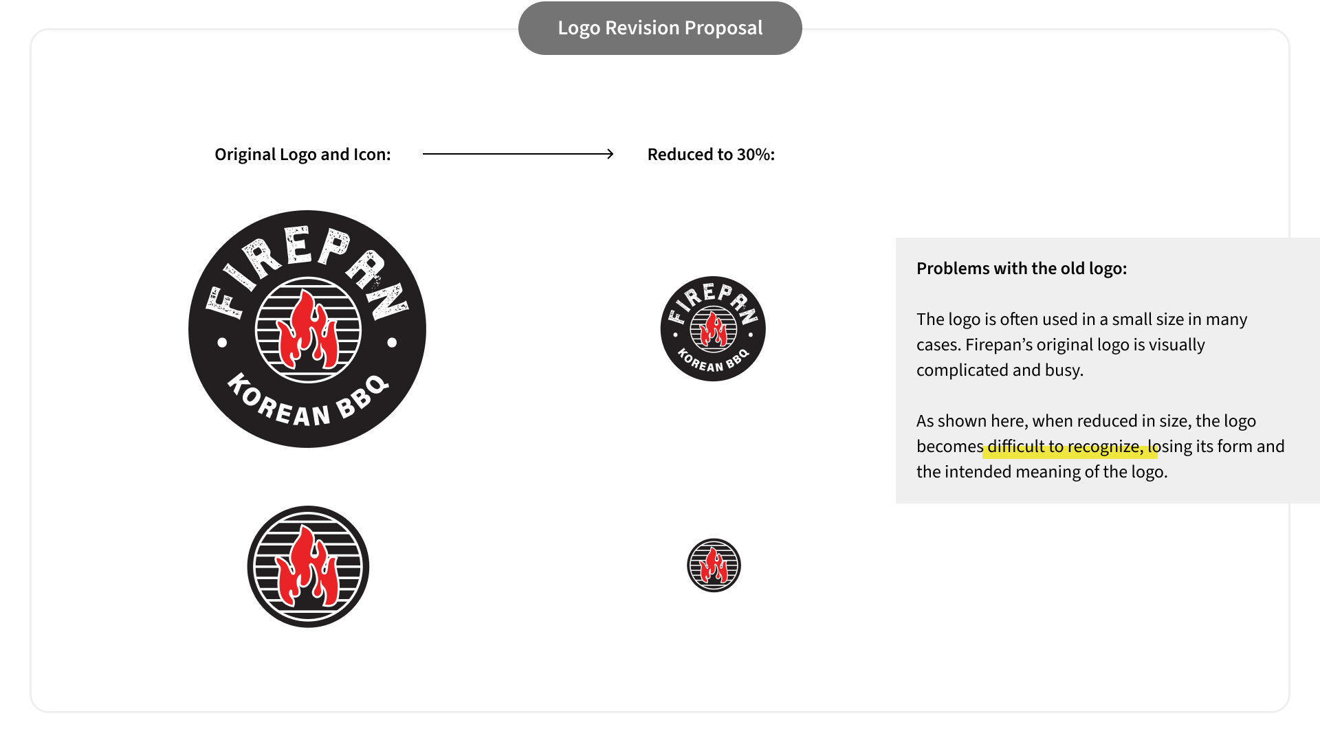
As a result of this presentation, clients had grasped the understanding of their current state and I successfully planted enthusiasm for what I could do to improve their branding. However, there was a disagreement between the clients and me concerning the idea of changing the logo. The old logo featured complex symbols and clients were reluctant to reduce any part of it. Although I understood their reasoning, I believed that simplifying the complicated logo seemed to be an important prerequisite step in establishing a strong and appropriate brand identity.
Objective #2: Educate clients about the importance of a simple logo
To effectively persuade and educate clients about the importance of modifying their old logo, it was crucial to provide them with insights into the fundamental principles of logo design – the purpose and meaning of logo and what makes a good logo.
This process of educating a disagreeing clients has ironically given me an opportunity to revisit the very basic yet essential and fundamental principles of logo design.

Principles of a Good Logo
Memorability: A good logo is easily and quickly remembered
Versatility: Adapts well across all platforms and sizes, maintaining their impact and legibility
Timelessness: Remains effective and relevant despite changing design trends
Appropriateness: Aligns with the brand’s industry, target audience, and identity
And above all,
Simplicity: Encapsulates a concise brand message in the simplest form
Paul Rand's quote best emphasizes the importance of simplicity:
“A design that is complex, fussy, or obscure harbours a self-destructive mechanism. No amount of literal illustration will do what most people imagine it will do. This will only make identification more difficult and the “message” more obscure. A logo, primarily, says who, not what, and that is its function.”
— Paul Rand
Contrary to clients' ambition to convey all the meaning within their logo, visual simplicity stands as a preliminary, key element for achieving all other criteria of a good logo design. A visually simple logo is not only easy to remember but is also versatile in its applications and timeless in its design.
I think a logo is like a name of a child. When naming their child, parents often seek a name with numerous blessings and beautiful meanings. In most cases, Korean names are constructed with Chinese characters, each carrying its unique meaning that adds depth to the name's meaning. They are not apparent but my name also embodies beautiful meanings that my grandfather has put together for his grandchild. All names have great intentions and meanings but they are usually abbreviated and abstracted across all languages and cultures because they need to comply with the main purpose of the name which is to be called quickly and with ease by oneself and by others in any situations.
“The primary goal of a logo is to identify.”
— Paul Rand
Just like a name, a logo needs to be recognized and recalled quickly and remembered for a long time. In order to achieve this purpose, visual simplicity helps a ton. A good logo may contain rich and distinctive meanings yet these meanings are cleverly abstracted into a simple, easily recognizable design.
Logo Solution
With this logic in mind, I have proposed a modified logo that achieved visual simplicity and versatility. This new logo works effectively across various situations and scales while still preserving the essential symbolic elements that were important to the client's original logo.


Through analysis, references and education about the principles of logo design, I successfully achieved agreement on the revision the client's old logo into a simplified and more versatile version.
This revision also introduced flexibility, enabling me to provide variations of the original logo in different formats.

New Brand Identity
Once a revised set of logos has been approved, I established a new brand identity and directions that are more suitable for the brand and versatile for various purposes. The brand guideline includes:
Logo formats and guidelines
A new set of brand fonts (header, decorative, and body fonts) and typography guidelines
A new color palette and color guidelines

The below moodboard demonstrates examples of brand colors, fonts and motifs use.

Applications and Deliverables
Once the branding direction and identity had been established, I worked diligently with clients to produce the necessary deliverables for Firepan's restaurant and promotions, which included:
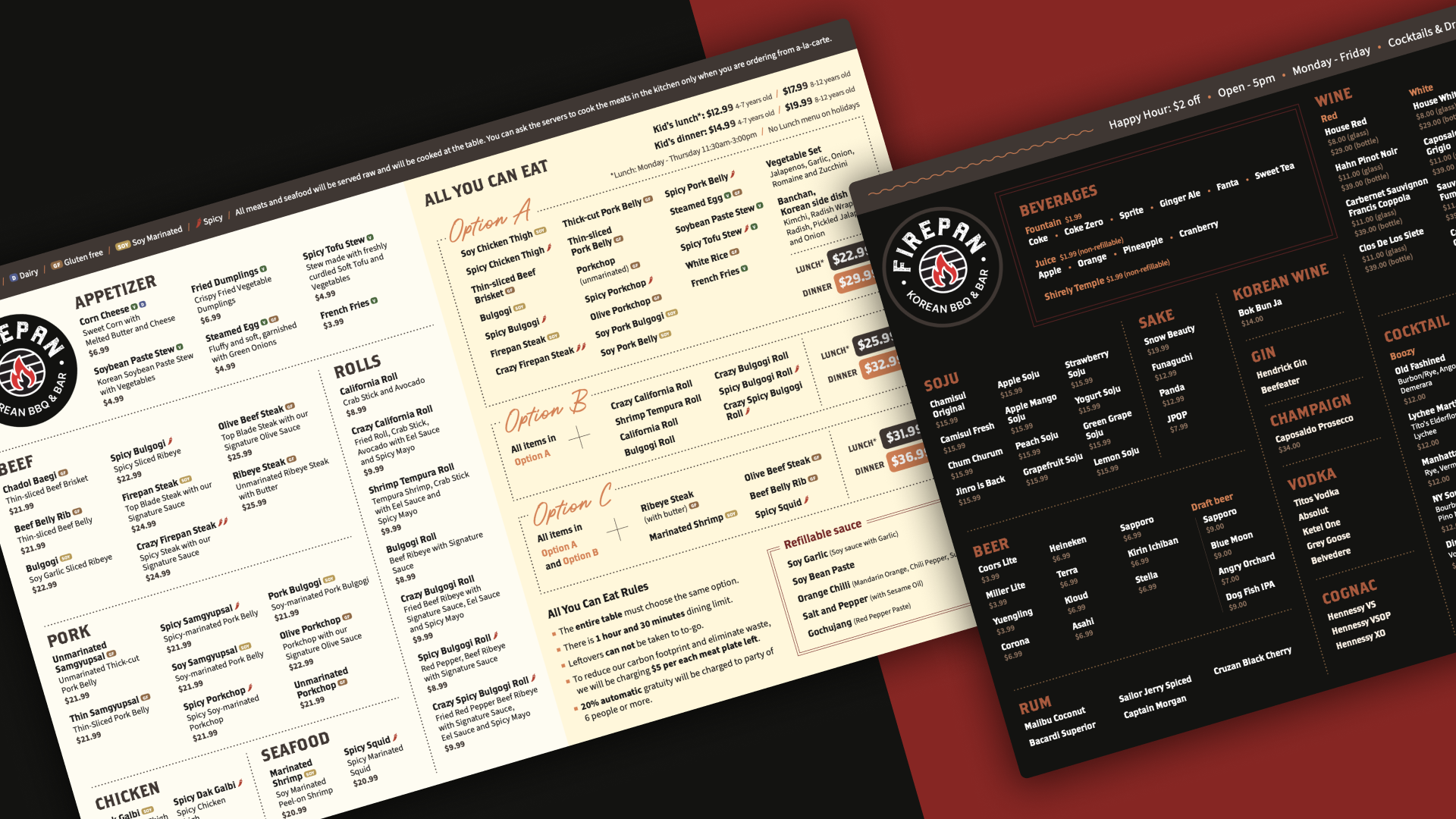
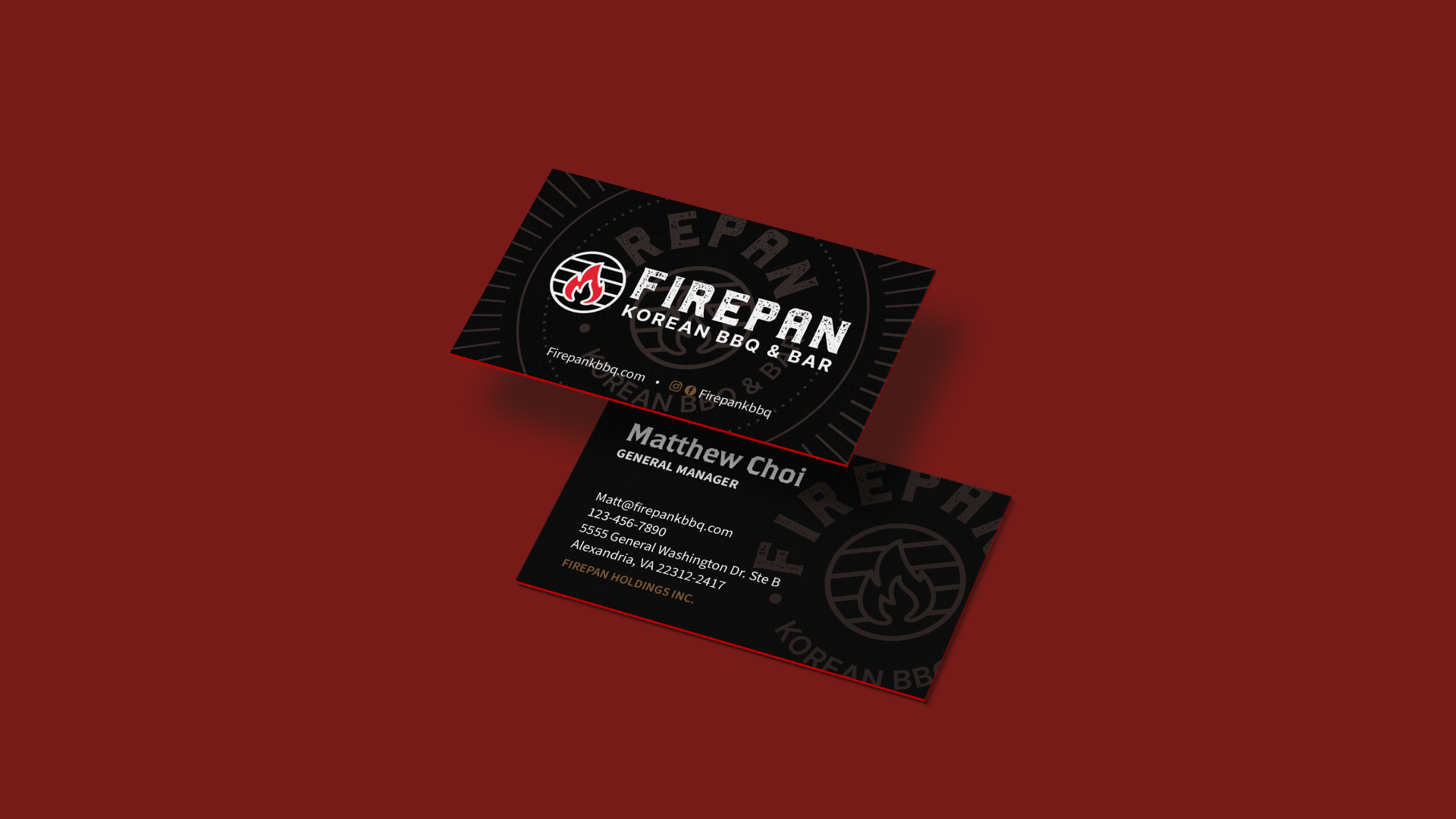
Dining and drink menus (print and digital)
Interior and exterior signages
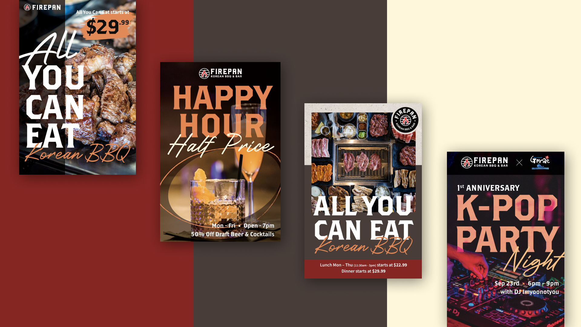
Promotional materials (print and digital)
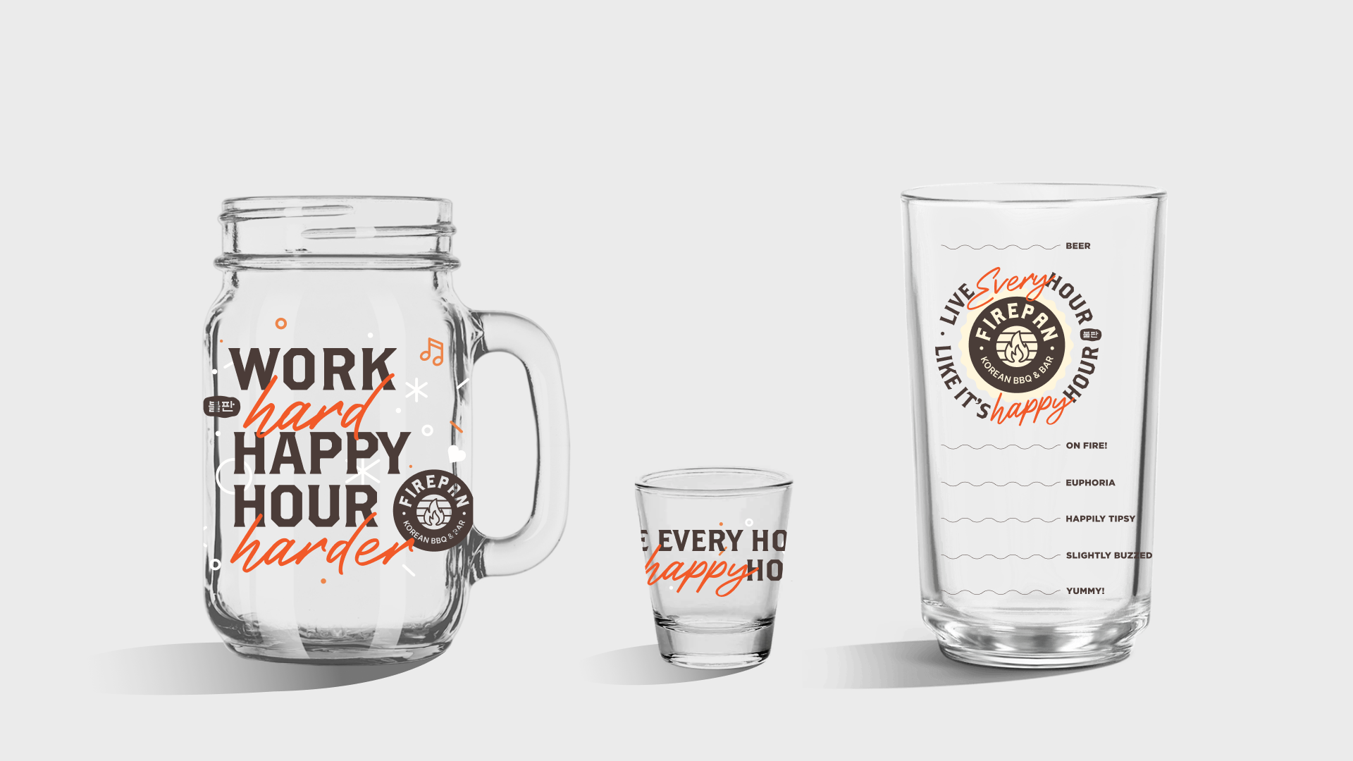
Branded merchandises